
Signage and workplace graphics are among the last elements installed in an office fitout, but they have a disproportionate impact on how the space is experienced. A well-signed office communicates professionalism before a word is spoken, guides visitors without confusion, and reinforces the brand identity at every turn. A poorly signed office creates a subtly negative impression that accumulates with every missed door, wrong corridor, and unsigned room that a visitor or staff member encounters.
Despite this impact, signage and graphics are often treated as an afterthought in the fitout process, specified late and delivered quickly with minimal design attention. The result is inconsistent typography, poorly positioned signs, and a visual environment that does not align with the rest of the fitout. Planning signage as a coordinated scope from the beginning of the design phase produces a significantly better outcome for a modest investment.
What Signage and Graphics Cover in an Office Fitout
The signage scope in a commercial office typically includes external signage on the building or tenancy entrance, reception signage and branding, wayfinding signage throughout the tenancy, room identification signage on doors and walls, safety and compliance signage including fire exit signs and first aid markers, and decorative graphics including feature walls, window films, and environmental graphics.
Each category serves a different purpose and has different design, material, and compliance requirements. External and reception signage communicates the brand to visitors and the public. Wayfinding signage helps people navigate the space. Room identification signage tells people where they are. Safety signage meets regulatory requirements. And decorative graphics enhance the visual environment and reinforce the brand or culture of the business.
The scope can be as simple as a reception logo and room number signs, or as extensive as a full wayfinding system with branded environmental graphics across the entire tenancy. The appropriate scope depends on the size of the office, the number of visitors, the complexity of the layout, and the brand investment the business wants to make in its physical environment.
Reception Signage and Brand Presence
The reception area is where brand signage has the most impact, and it is typically the area where the most design attention and budget is directed. The primary element is usually a logo or company name displayed prominently behind or above the reception desk, positioned to be the first thing visitors see when they arrive.
The material and construction of reception signage communicates the business’s character. Flat-cut metal letters in brushed stainless steel or powder-coated aluminium convey a corporate, precise aesthetic. Dimensional acrylic letters with edge-lit LED illumination create a contemporary, technology-forward impression. Timber letters or laser-cut timber panels suit businesses with a warm, natural brand identity. Vinyl lettering applied directly to the wall is the most cost-effective option but lacks the dimensional quality and visual presence of three-dimensional solutions.
Illuminated signage, whether backlit, edge-lit, or halo-lit, adds visual impact and ensures the brand is visible regardless of ambient lighting conditions. Halo-lit signage, where the light source is concealed behind dimensional letters to create a soft glow on the wall behind, is particularly popular in corporate reception areas because the effect is sophisticated without being overstated. The electrical connection for illuminated signage needs to be coordinated with the fitout electrician during the rough-in phase, because a power supply needs to be positioned behind the sign location before the wall is finished.
Wayfinding in Larger Offices
In offices that occupy large floor areas or multiple levels, wayfinding signage is essential for helping visitors and staff navigate the space without asking for directions. A good wayfinding system is intuitive, consistent, and positioned at decision points where people need to choose a direction.
The key decision points in most offices are the lift lobby or entrance, the reception area, corridor junctions, and the boundaries between different functional zones. At each of these points, signage should indicate the direction to the main areas visitors need to find: reception, meeting rooms, bathrooms, the kitchen, and any other shared facilities.
Consistency in wayfinding signage is critical. Every sign in the system should use the same typeface, colour scheme, icon style, and mounting height. Mixed styles, ad-hoc additions, and inconsistent positioning undermine the system’s effectiveness and create visual noise that is worse than no signage at all. A well-designed wayfinding system looks like it was planned as a single, coherent piece of work, because it was. In offices where relocation and fitout planning are coordinated, the wayfinding system is designed alongside the floor plan so that signage positions align with sightlines and circulation paths.
Room Identification and Functional Signage
Room identification signage tells people which room they are approaching and, in some systems, whether the room is currently in use. The simplest approach is a printed or engraved nameplate beside each door. More sophisticated systems include digital room panels that integrate with the booking system to show the current meeting, the next scheduled booking, and availability status.
Digital room panels are increasingly common in offices that use meeting room booking software. The panel, typically a small touchscreen mounted beside the meeting room door, shows real-time availability and allows ad-hoc bookings from the panel itself. The panels require power and data connections, which need to be planned during the electrical rough-in phase, and the mounting position should be consistent across all meeting rooms for visual uniformity.
Functional signage beyond room names includes bathroom identification, kitchen and breakout labelling, fire warden locations, first aid station markers, and any regulatory signage required by the building or the tenancy’s occupation certificate. Safety signage has specific requirements under Australian standards for size, colour, and positioning, and these requirements must be met regardless of how the rest of the signage system is designed. The practical approach is to design the safety signage within the same visual language as the rest of the system, maintaining compliance while keeping the overall signage environment cohesive.
Window Films, Graphics, and Environmental Branding
Window films and environmental graphics transform plain surfaces into branded or decorative elements that reinforce the character of the workspace. Window films applied to glass partitions and external windows serve both functional and aesthetic purposes: they can provide privacy, reduce glare, meet manifestation requirements for safety compliance, and display brand graphics or patterns that enhance the visual environment.
Manifestation markings on glass partitions are a compliance requirement under Australian building codes. Any full-height glass panel in a circulation path must have visible markings to prevent people from walking into it. Rather than treating manifestation as a regulatory imposition, many businesses use it as an opportunity for branded graphics, repeating patterns, or design elements that contribute to the aesthetic of the space while satisfying the safety requirement.
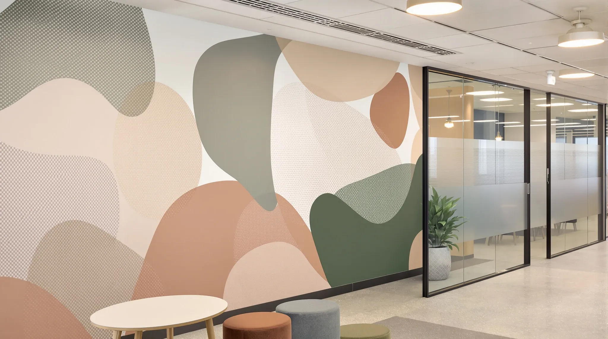
Feature walls with printed graphics, vinyl murals, or textured finishes are another form of environmental branding that can transform a blank wall into a visual statement. These are commonly used in reception areas, corridors, and breakout spaces where a large blank wall would otherwise feel empty or institutional. The graphic content can range from abstract patterns and photographic imagery to brand values, timelines, or cultural statements. In a complete fitout, environmental graphics are most effective when designed as part of the overall interior concept rather than added as an afterthought.
Materials, Production, and Installation
Signage and graphics materials range from simple self-adhesive vinyl through to fabricated metal, acrylic, timber, and illuminated elements. The material selection should reflect the permanence of the installation, the visual standard expected, and the budget.
Vinyl signage and graphics are the most versatile and cost-effective option. Printed vinyl can reproduce any image, colour, or pattern, and can be applied to walls, glass, floors, and furniture. Cut vinyl produces clean text and logo shapes in solid colours. The limitation of vinyl is that it is a flat, surface-applied product, so it lacks the dimensional quality of fabricated signage. In high-visibility areas like reception, dimensional signage typically delivers a stronger impression.
Fabricated signage in metal, acrylic, or timber provides the dimensional quality that elevates the signage from functional to impressive. These elements are typically manufactured off site and installed by specialist signage installers, who manage the precise positioning, mounting, and electrical connection of each item. The installation sequence within the fitout programme places signage after painting and general cleaning are complete, so the finished surfaces are not damaged during sign installation.
Planning Signage Early in the Fitout Process
The most common mistake with office signage is leaving it until the fitout is nearly complete. By that point, the electrical connections for illuminated signs may not be in the right location, the wall finishes may not suit the intended signage mounting method, and the design time available is compressed, leading to rushed decisions and generic results.
Planning signage from the design phase forward means the electrical connections are positioned correctly, the wall substrates are specified to support the mounting method, the colour palette aligns with the interior finishes, and the overall signage system is coherent rather than assembled piecemeal. It also means the signage production lead time, which can be three to six weeks for fabricated elements, is factored into the programme rather than creating a delay at the end.
The budget for signage and graphics in a commercial office fitout is typically modest relative to the overall project cost, but the impact on the visitor experience and staff environment is significant. Refreshing a workspace to reflect the brand extends beyond paint colours to every visual element in the space, and signage is one of the most visible and cost-effective ways to reinforce who the business is and how it wants to be perceived.
If you are planning signage and workplace graphics as part of an office fitout and want a coordinated system that works with the rest of the design, we can help with the design, production, and installation.
Call us on 1300 60 93 93