
Wayfinding in a single-floor tenancy is usually straightforward. A reception desk, maybe a directory of internal meeting rooms, a couple of door labels for function rooms and the job is done. Multi-floor tenancies are a different problem entirely. Visitors who step out of a lift on the wrong level, staff who need to move between teams on different floors, clients who arrive without a host: each of those journeys is only as clear as the signs between the lift doors and the person’s destination.
The design of that signage is rarely a standalone project. It sits inside the larger fitout, sharing wall real estate with reception desks, feature walls, meeting-room partitions and kitchenette zones. Getting it right means thinking about it while the fitout is being drawn, not adding it as a finishing touch when the space is already built.
What Multi-Floor Wayfinding Has To Solve
Three distinct user journeys have to work on a multi-floor tenancy. The first is the external visitor who has been told a company is on the fourth floor but arrives at the building not knowing which lift bank to take, which floor the reception sits on, or how to get from a lift lobby to the reception desk.
The second is the staff member who works on level three but needs to attend a meeting on level five without losing time. The third is the supplier or courier arriving with goods who needs to find a receiving point that may not be on the main reception floor.
Each journey has different needs. The visitor needs to be confidently delivered from the building entry to a staffed reception, which usually means consistent branding at each step and clear signs that identify the tenant from within the building’s shared circulation. The staff member needs fast within-tenancy signage that identifies lift lobbies, stairs and zones without having to stop and read. The supplier needs an early branching-off point that diverts them from the main visitor path to the service entry.
Wayfinding that tries to serve all three journeys with the same signage usually serves none of them well. Signage that is layered, with different scales and locations for different user types, reads as thoughtful without feeling over-designed.
Reception-Level Orientation
The reception floor carries the heaviest signage load because it is where the visitor resolves their first uncertainty. A visitor arriving at the reception level needs to see, within two or three steps of leaving the lift, which direction the reception desk sits and whether they have come to the right tenancy at all.
The strongest way to do that is with clear brand presence at the lift lobby: a logo sign, a wall finish or a feature element that confirms the tenant immediately. Pairing that with a directional cue toward the reception, whether a visible desk, a floor pattern, or an arrowed sign if the geometry requires it, resolves the first two questions together.
Where the reception lobby serves multiple departments or divisions of the same organisation, the signage at this point also has to handle onward navigation. A secondary-tier directory, either at the reception desk or in a side lobby off the main lift bank, gives visitors who already know where they are going a way to proceed without queuing at reception.
Lift-Lobby Signage On Arrival Floors
Floors above or below reception present a different problem. A visitor who has been directed to level five from reception needs the lift lobby on level five to confirm they are on the right floor, and then guide them to the specific meeting room, department or host they are heading for. Staff moving between floors need a smaller version of the same information.
A common pattern that works is a floor-identifying sign directly visible from the lift doors as they open, followed by a secondary directory or zone-indication sign within a few steps of the lobby. The first sign resolves “am I on the right floor”; the second resolves “where do I go from here”.
The common mistake is relying on brand identity alone at non-reception floors. If every floor shows the same logo but nothing that distinguishes level three from level five, the visitor who stepped out of the lift a floor early has no cue that they have made a mistake until they have walked some distance into the tenancy. A simple floor number or level identifier visible from the lift solves that cleanly.
Inter-Floor Staircase Marking
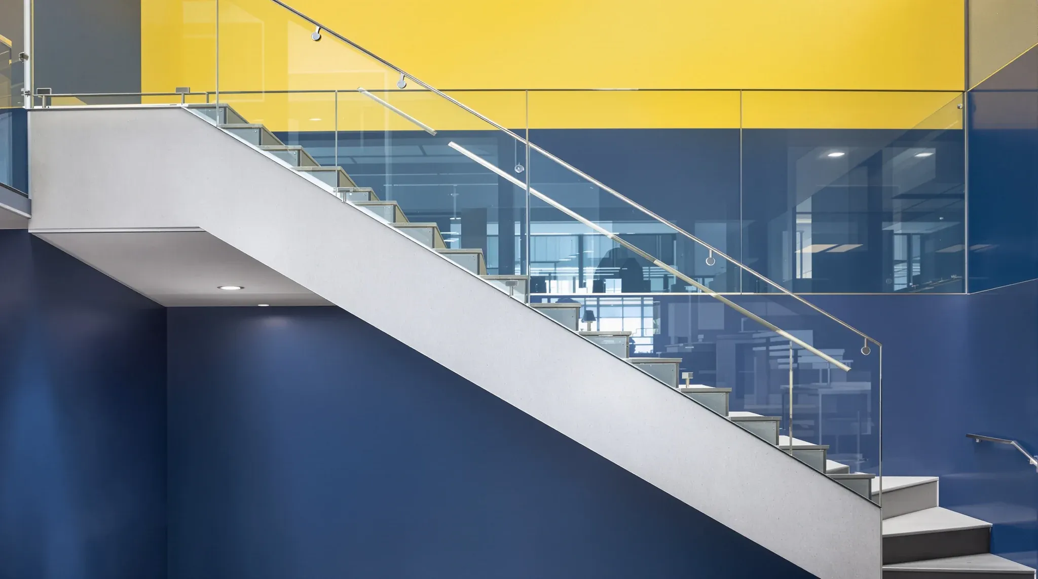
Internal staircases within a tenancy that connect multiple floors need their own wayfinding layer. Users at the top of the stairs need to know which floors are accessible via the stair, and in which direction. Users entering the stair from a floor need to know which floors they can reach and where the stair emerges.
The cleanest treatment is a simple identifier at each stair landing, showing the floor number and any zone name associated with that level. A consistent graphic and mounting position across every landing makes the stair a reliable internal navigation route rather than a fallback used only when the lifts are busy.
Emergency stair signage is a separate compliance category and is usually governed by base-building requirements rather than tenant choice. Internal tenancy stairs sitting inside the fitout are different: they are a tenant-side design decision and the wayfinding for them is part of the fitout brief. Mixing the two up, or leaving internal stair signage to be handled as part of emergency egress, is a common way to end up with a staircase that no one uses casually because no one knows where it goes.
Zone And Department Identification Within Each Floor
Within a single floor, the wayfinding decisions narrow to zone and room identification. A large floor with a reception, a client-meeting suite, a team working zone, a breakout space and back-of-house support areas needs clear boundaries between those zones if visitors are going to find their meeting room without an escort.
Zone signage works best when it is subtle. A signage band at the entry to each zone, a different floor finish, a partition height change or a colour change can all work as wayfinding cues without turning every wall into a label. Individual rooms within each zone then carry simple identifiers: a name, a number, or both, mounted at a consistent position and size.
Departmental signage is a tougher call. Teams change, reorganisations happen, and signs that name a specific department on a specific wall become out of date within a year or two of a fitout’s life. The useful discipline is to sign zones by function (Client Meeting Suite, Project Rooms, Breakout, Reception) rather than by team name, and let the teams move around within those functional zones without invalidating the signage.
Visitor Paths Versus Staff Paths
The best multi-floor fitouts silently separate visitor paths from staff paths. Visitors move from the building entry to reception, from reception to a meeting room or client suite, and back out the same way. Staff move between their desks, the lift lobbies, shared zones and back-of-house support areas on a completely different pattern.
Signage that is obvious to visitors but nearly invisible to staff, because staff have stopped seeing it after the first week, is the mark of a well-designed system. Signage that is loud and necessary for staff operations, because they reference it daily, often means something is wrong with the underlying layout.
The visitor path gets signed explicitly. The staff path gets signed in reduced form, mainly for new starters and for visitors who have been given a staff badge and are moving beyond the reception envelope. A third path for deliveries and maintenance sits quieter again, usually with a discreet sign at the branching point that redirects goods away from the main visitor route.
Consistency Across Floors
A multi-floor tenancy reads as one organisation only if the signage system reads as one system across every floor. That does not mean every floor gets identical signage. It means the graphic language, the sign mounting conventions, the colour choices and the material choices stay consistent, so a visitor who has learned to read signs on one floor reads them without re-learning on every other floor.
The consistency has to survive staged occupation. Large multi-floor fitouts are often built in stages, with one floor completed and occupied before the next starts. Signage specified and supplied by the same supplier across all stages, even when installation is months apart, produces a cleaner final result than signage commissioned per floor. The alternative of slightly different fonts, colours or mounting approaches on each floor is one of the quieter markers of an uncoordinated fitout.
Brand guidelines sit alongside the signage system rather than dictating it. The brand palette, logo treatment and typographic voice inform the signage, but the wayfinding layer has to work for navigation first and brand expression second. Signs that are beautiful but unreadable at their intended viewing distance solve the wrong problem.
Specifying Wayfinding Alongside The Fitout
The useful discipline is to sketch the wayfinding system at the same time as the floor plan, not after. The designer needs to know where signs will be mounted before specifying feature walls, where directory panels will sit before positioning reception desks, and where lift-lobby signs will land before finalising the wall finishes around the lifts.
Wayfinding coordination also benefits from being tested as a walk-through during design development. Tracing the visitor path on the floor plan with the signage layer switched on, checking whether someone could find a meeting room from the reception lift without speaking to anyone, reveals gaps in the signage earlier than construction does.
If you want us to walk through the wayfinding logic for a multi-floor tenancy and coordinate it with the partition, reception and zoning decisions before the fitout construction begins, we can do that as part of a full fitout engagement. The system is cheaper to build in than to retrofit, and the difference in how a multi-floor office feels to visit is bigger than the cost of the signs themselves.
📞 Call us on 1300 60 93 93